Clayfin
What if the biggest risk in a banking app isn't security , it's confusion?
fintech
|
500K+ users
|
★ IBSi Global FinTech Innovation Award 2022
In India, 38% of banking users preferred Google Pay or Paytm over their own bank's app not for features, but because every inconsistency in the interface created a moment of doubt. And in banking, doubt feels like risk.
Role
Lead UX Designer
Timeline
7 Months
Platform
Tablet & Mobile


67%
of millennials rated competitor interfaces more intuitive than traditional bank apps
60%
of 18–26 year old banking consumers used smartphones to interact with their bank
73%
of customers expect their bank to match the simplicity of apps they already used.
Context
A design decision here ships to 500,000 real users.
Clayfin builds white-label digital banking platforms for financial institutions. The platform launched in India and has since been deployed across APAC, the Middle East, and Africa. I led UX at Neointeraction, embedded with Clayfin's product and engineering teams for the full retail banking redesign.
Scope
Dashboard · Payments · Onboarding · DS
Markets
India (launched) · APAC · MENA · Africa (scaled)
Constraint
Every decision must work across multiple banks' brands and regs
What we found
Three root causes. All pointing to the same thing: users didn't trust the bank's own app.
Competitive analysis and user interviews surfaced three structural pain points consistent across every traditional banking app we audited.
Inconsistent experience across every touchpoint
Navigation patterns, visual language, and interaction models shifted between modules inside the same app. Payments felt different from Accounts, which felt different from Settings.

Third-party apps had already won on trust
Google Pay and Paytm had built years of reliable, simple interactions. 38% of users actively preferred them over their own bank's app. Clayfin had to match that trust baseline from scratch.

The app covered transactions not users' financial lives
Users needed budget tracking, savings goals, investment insights, and a unified view of personal and business finances. The app gave them a ledger.

DESIGN DECISIONS
Design for the job, not the screen
Tablet users were sitting down to review finances, check statements, manage accounts. Mobile users needed to pay someone in 10 seconds. Same design system, completely different task hierarchy.
context-first per device
responsive scaling
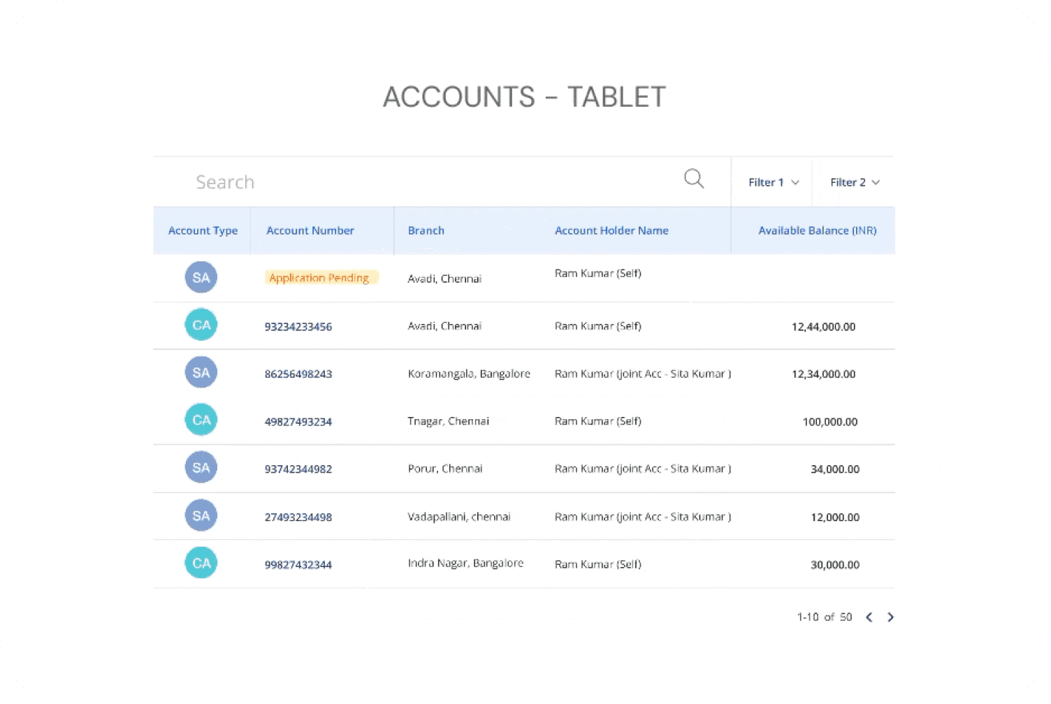
Research said users opened the app for one question, "is my money okay?" A cluttered dashboard doesn't answer that. It creates the same moment of doubt that drives them to Paytm instead.
balance + activity first
feature-rich dashboard

Make security feel like protection
A progressive trust model that has light checks upfront, escalating only when the action warranted it matched how people actually think about risk
progressive trust model
front-loaded verification

finance as a core layer
bolt-on finance features

Research


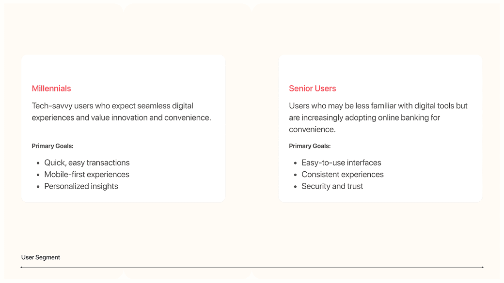


How might we make a bank's own app as trusted and intuitive as the third-party apps users already prefer?
Centralized Dashboards
Balance and recent activity lead. Payments, accounts, and lifestyle features all within two taps. The dashboard answers one question first: is my money okay?

SEAMLESS ACCOUNT EXPERIENCE
Simple & personalized overview of all the accounts, and in depth details of the account, statements, deposits & cards.

TAKE CONTROL OF YOUR FINANCES
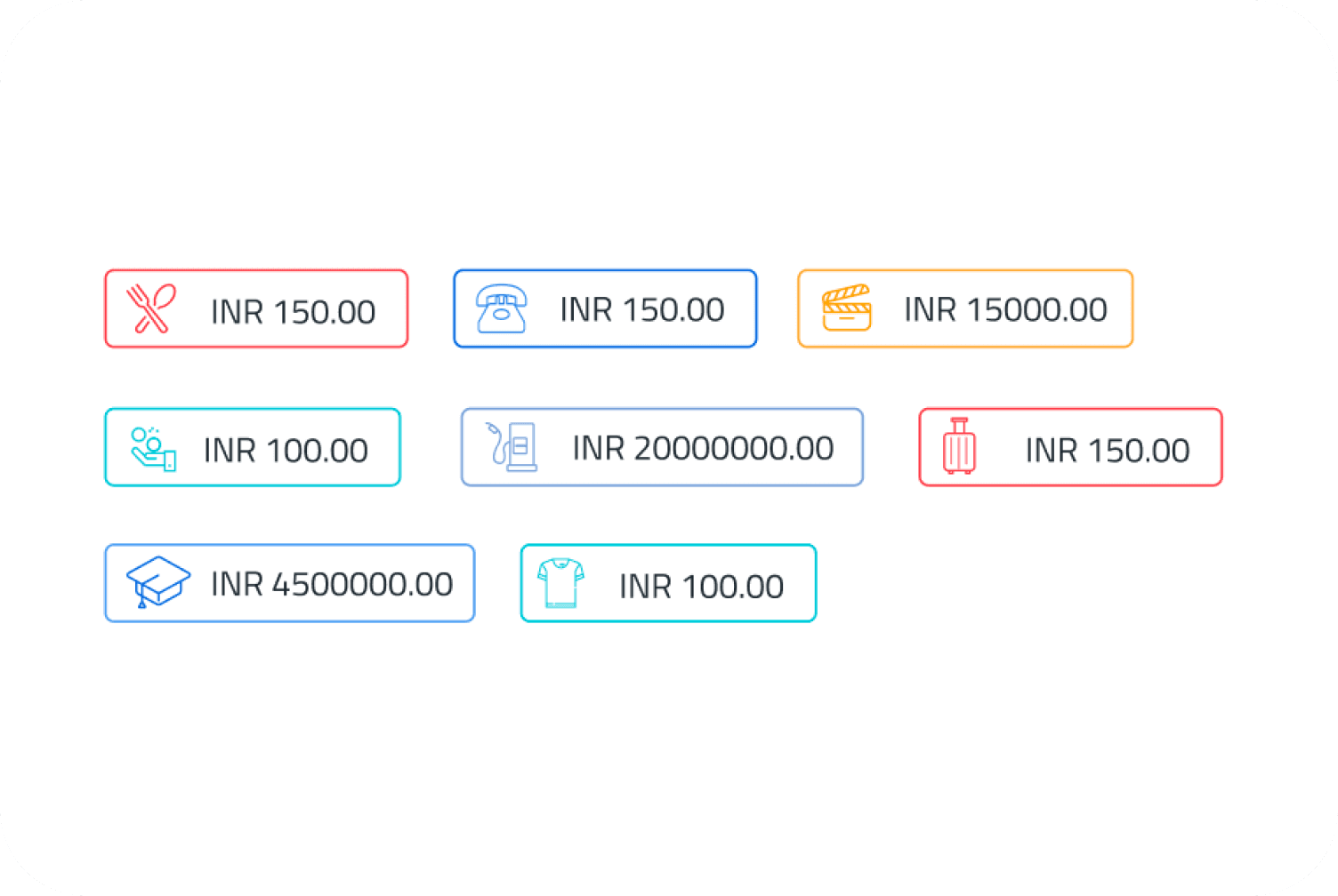
Get detailed insights into your expenses and income, categorized by type and tracked monthly. Set and achieve your financial goals with ease.

What CHANGED
The platform kept winning new banks, years after launch.
★ IBSi Global FinTech Innovation Award 2022
34%
active users at Bandhan Bank · 5,600+ outlets ·
151
nominations beaten to win IBSi's Best Digital Platform
75+
implementations across 25+ institutions by 2024.

Designing for one bank taught me what designing for thirty actually requires.
The research, the personas, the competitive analysis all of it was shaped by India's market at launch. But the platform was always going to scale across APAC, MENA, and Africa.
I made design decisions grounded in one context and handed them to banks in very different ones. If I did this again, I'd have built explicit cultural flexibility into the interaction patterns not just brand tokens.
More projects